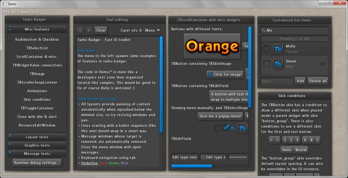
Turbo Badger
This post dangled for a while in as draft. I didn't finish the project but still will post it....
Atm I'm developing a small multiplayer 'catch'-game using urho3d and its scene-replication. I never really got used to the inbuilt UI (not sure why I didn't try to wrap my head around that first) Long story short, I found a Turbo Badger-Implementation for urho3d and use this now.
Not that this is self-explainatory due to really not that much documentation 😉. So I will collect some information about it.
A good starting point is the demo and its sourcecode
Here all the available attributes for the template-language(tb_widget_attr.tb.txt):
#
# List of supported resource attributes for all default widgets in Turbo Badger.
# All widgets of course support the attributes read by the classes they inherit (such as TBWidget).
#
# <bool> 				- 0 or 1
# <number> 				- number
# <id> 					- number or string. Read into an TBID
# <dimension> 			- numbers with optional unit (default is dp). F.ex 10mm
# <string> 				- string
# <string/lngstring>	- string or language string (f.ex "@search")
# <sub...>				- child widgets or attributes
# foo, bar				- either foo or bar.
# foo | bar				- flag combo of foo and bar.
#
# Note: As all node based resources, nodes/values may reference other node trees,
#       use conditions and local & file includes.
#

TBWidget
	id <id>
	group-id <id>
	value <number>
	data
	is-group-root <bool>
	is-focusable <bool>
	want-long-click <bool>
	ignore-input <bool>
	opacity <number> (0-1)
	text <string/lngstring>
	connection <string>
	axis x, y
	gravity left | top | right | bottom | all
	visibility visible, invisible, gone
	state disabled
	skin <id>
	lp
		width <dimension>
		height <dimension>
		min-width <dimension>
		min-height <dimension>
		max-width <dimension>
		max-height <dimension>
		pref-width <dimension>
		pref-height <dimension>
	font
		name <id>
		size <dimension>
	rect <x, y, width, height>
	autofocus <bool>
	<sub...>
TBClickLabel
TBEditField
	multiline <bool>
	styling <bool>
	readonly <bool>
	wrap <bool>
	adapt-to-content <bool>
	virtual-width <dimension>
	placeholder <string/lngstring>
	type text, search, password, email, phone, url, number
TBTextField
	text-align left, center, right
TBLayout
	spacing <dimension>
	size preferred, available, gravity
	position center, left, top, right, bottom, gravity
	overflow clip, scroll
	distribution preferred, available, gravity
	distribution-position center, left, top, right, bottom
TBScrollContainer
	adapt-content <bool>
	adapt-to-content <bool>
	scroll-mode xy, y, y-auto, auto, off
TBTabContainer
	align left, top, right, bottom
	tabs
		<sub...>
	content
		<sub...>
	root
		<sub...>
TBButton
	toggle-mode <bool>
TBScrollBar
TBSlider
	min <number>
	max <number>
TBInlineSelect
	min <number>
	max <number>
TBSelectList
	items
		item
			text <string/lngstring>
			id <id>
TBSelectDropdown
	items
		item
			text <string/lngstring>
			id <id>
TBCheckBox
TBRadioButton
TBSkinImage
TBSeparator
TBProgressSpinner
TBContainer
TBSectionHeader
TBSection
TBToggleContainer
	toggle enabled, opacity, expanded
	invert <bool>
TBImageWidget
	filename <string>